NOTION MAGAZINE // 24.06.16 // THE DEEP BLUE OF SUMMER: KEEPING NAVY CURRENT
June 24, 2016All our favourite designers are making navy interesting again
SS16 has been a great season for menswear. We are ditching the jeans,
and throwing on the playsuits, high-waisted trousers and tailored short
shorts. For our top halves, summer blazers are back and with enough
chiffon to swim in. While navy is commonly seen in jackets and trousers,
a full navy look shouldn’t be sneered at. Matching navy with the right
colours can show off an item’s detailing, removing all the components
that stop the garment looking too flat. Below are the designers that are
doing navy so well this season, so scroll down and get some inspo for a
chic summer.
CRAIG GREEN
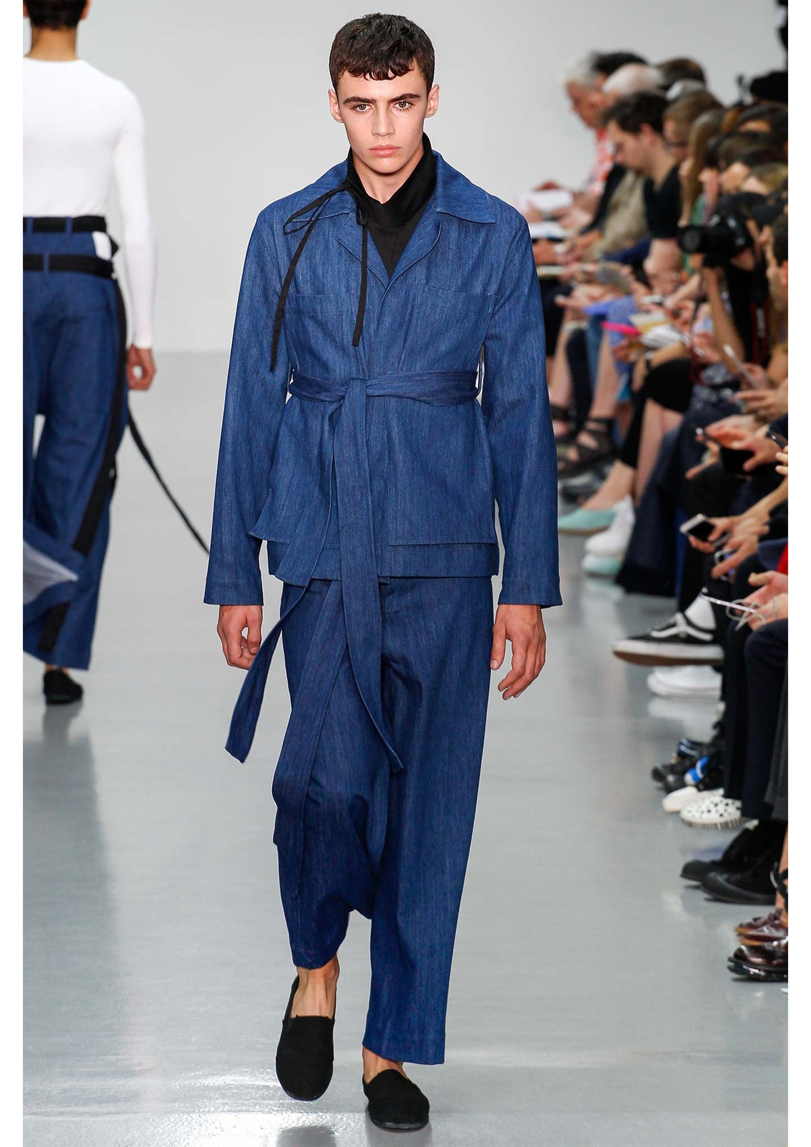
Since AW13, Craig Green has been known for his cutting-edge,
architectural inspired collections; using block colours to his
advantage, accentuating detail and panelling. This season is no
different. The sheen on the denim for this particular looks helps to
emphasise the belt and pockets on the jacket, and is framed by the black
turtleneck and shoes, which keeps the look together. The black pieces
add depth to the shadows created by the garment.
CHRISTOPHER KANE
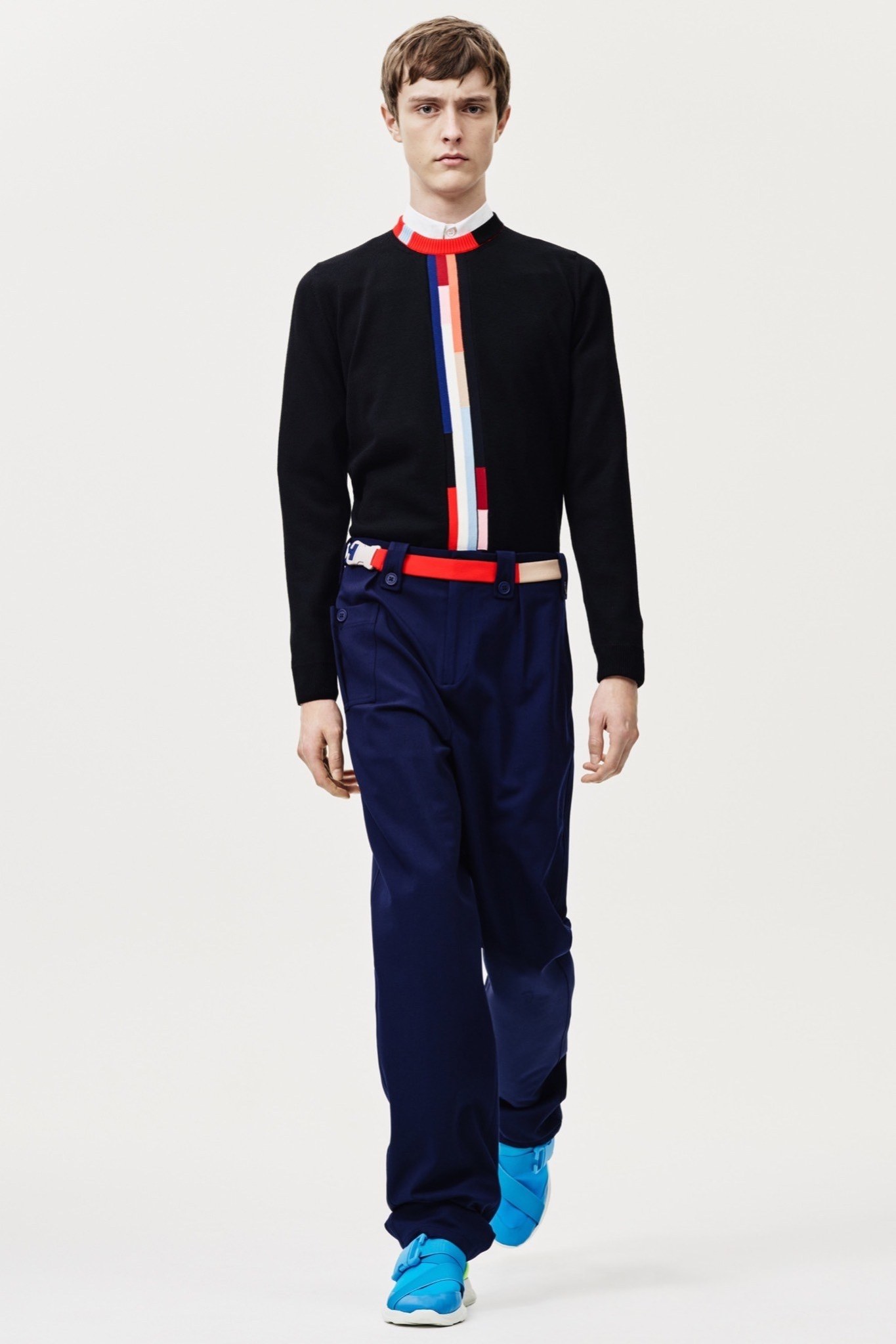
Let’s move on to Christopher Kane for our next example of navy done
well. Even though he’s used a darker navy in this look, Christopher Kane
has succeeded in giving these trousers depth by pairing them with
brighter accessories and a colourful trim on the jumper.
Using black on the top half, instead of white, makes the red and blue
appear brighter. These accents give the whole piece a Spring/Summer
vibe, but take those away and it could easily become part of an
Autumn/Winter collection.
MSGM
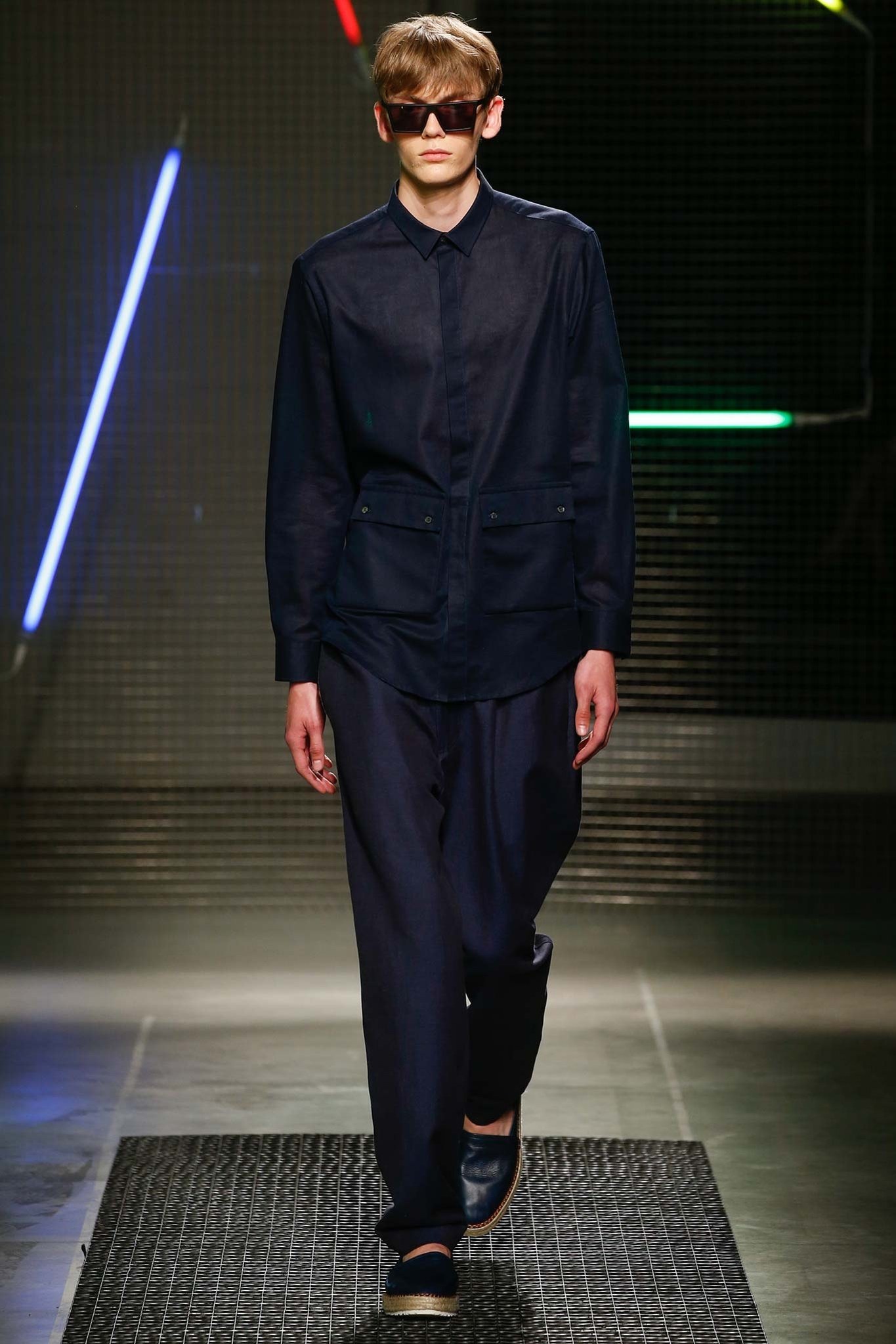
Massimo Giorgetti has shown a great example here of how to use a deeper navy for a Spring/Summer look in his SS16 collection.
Chiffon and other translucent fabrics are becoming increasingly
popular in menswear again. Keeping cool in a dark shade that soaks up a
lot of light and therefore generating heat can be a difficult task, but
the best way to help that is by using lighter textiles. The placement of
the pockets at the bottom of the shirt adds layers to not make it too
transparent the whole way down the torso, keeping some modesty. The
whole look gives off the feeling of luxe.
HARDY AMIES
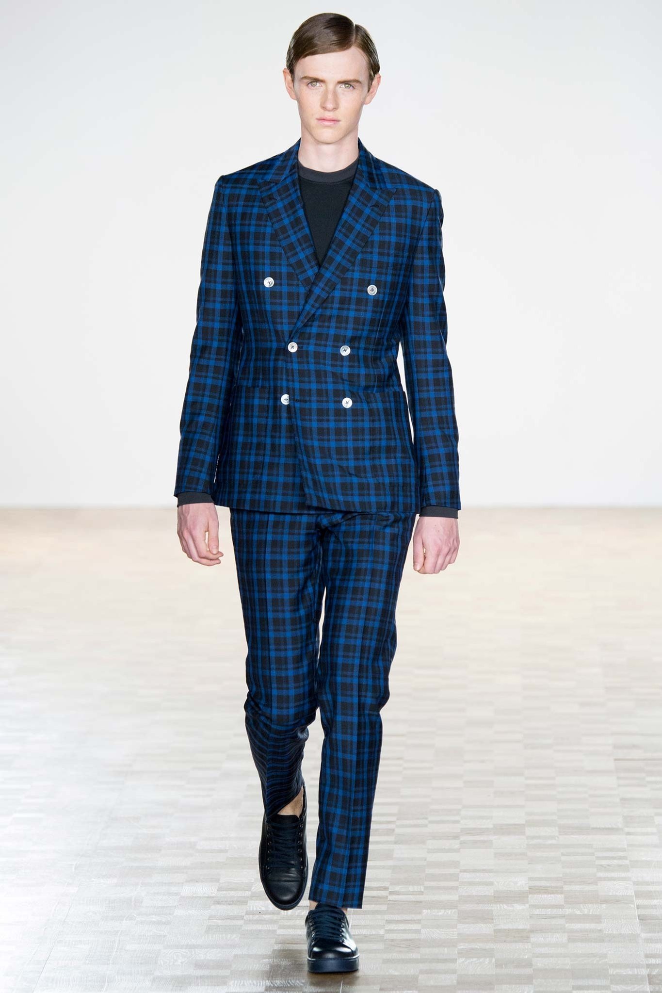
A suit can look terribly flat in navy if it’s just a block colour,
however, dark blue co-ordinates are a favoured option for formal
occasions in the summer.
Hardy Amies has created this checkered suit that could be worn for a
formal occasion, or paired with a t-shirt for a more casual outing. The
pearl coloured buttons give a playfulness to the suit also without
taking away from the quality of the suit itself. With the colours
already in the check, this is a navy outfit to be styled with black or
charcoal accessories instead of burgundy or brown.
CASELY-HAYFORD
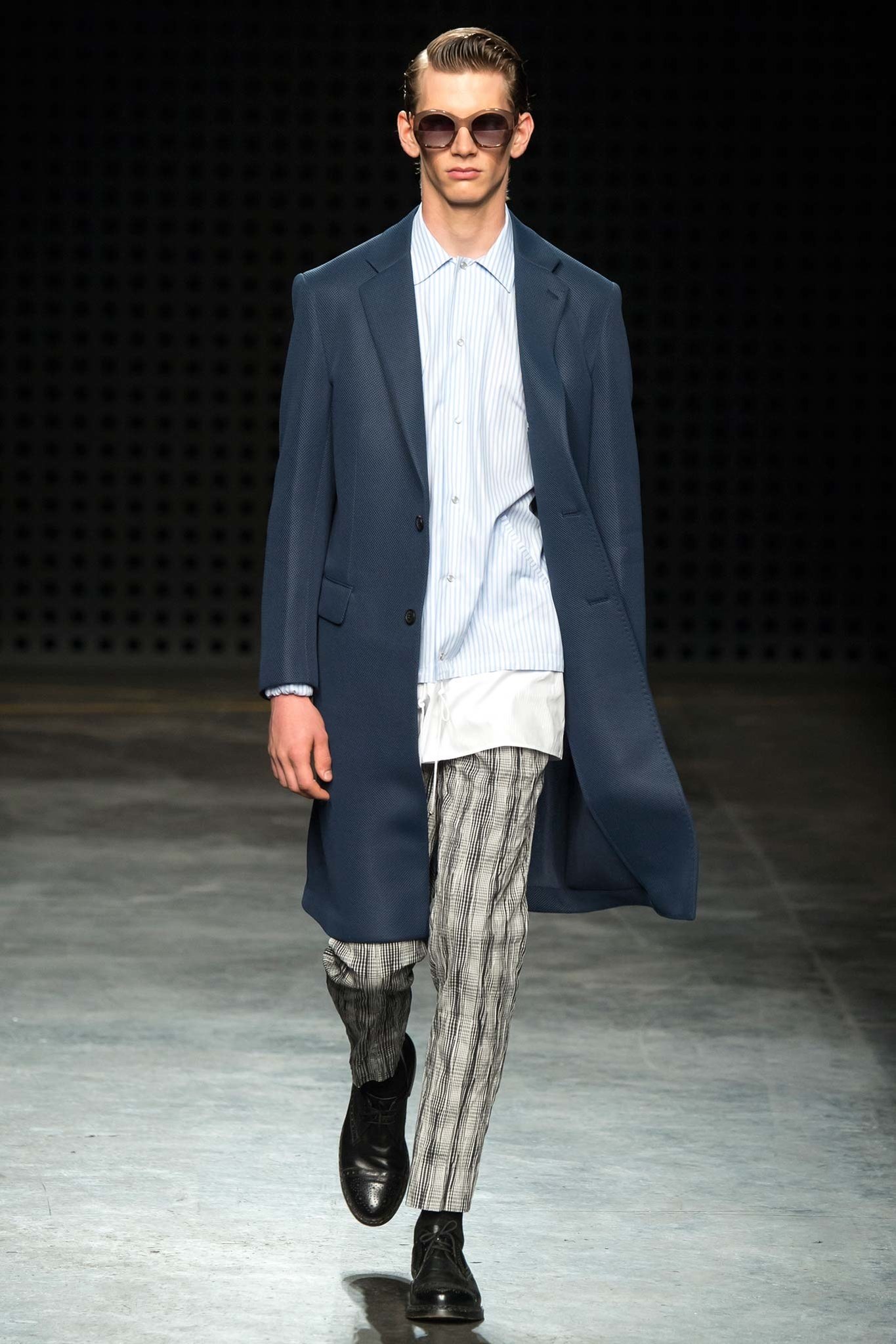
When you wear a block colour garment like Casely-Hayford’s jacket in
this image, styling it with brown accessories and prints can add texture
to the overall look.
The print in these trousers work vertically, which elongates the
model, but also mirrors the direction of the fabric’s texture. The long
shirt used adds interesting proportions to the outfit as a whole.
MATTHEW MILLER
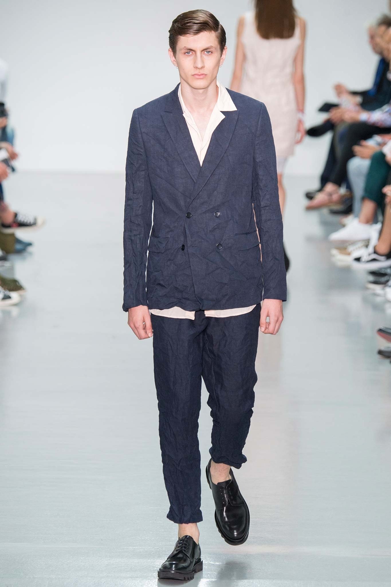
Matthew Miller gives another example here of how to breathe life into an otherwise dull block-coloured navy suit.
By using creased linen in his suits, the texture of the suit looks
lighter and breaking up this look with a low-buttoned, un-tucked shirt,
Matthew Miller ensures the look appears less formal and heavy. The light
nature of the fabric also gives off some Miami Beach-type vibes. Ideal
for summer.
The slightly washed-out colour of the navy also makes the creases in
the linen highlighted, making the texture look purposeful, instead of
accidental.
ANTONIO MARRAS
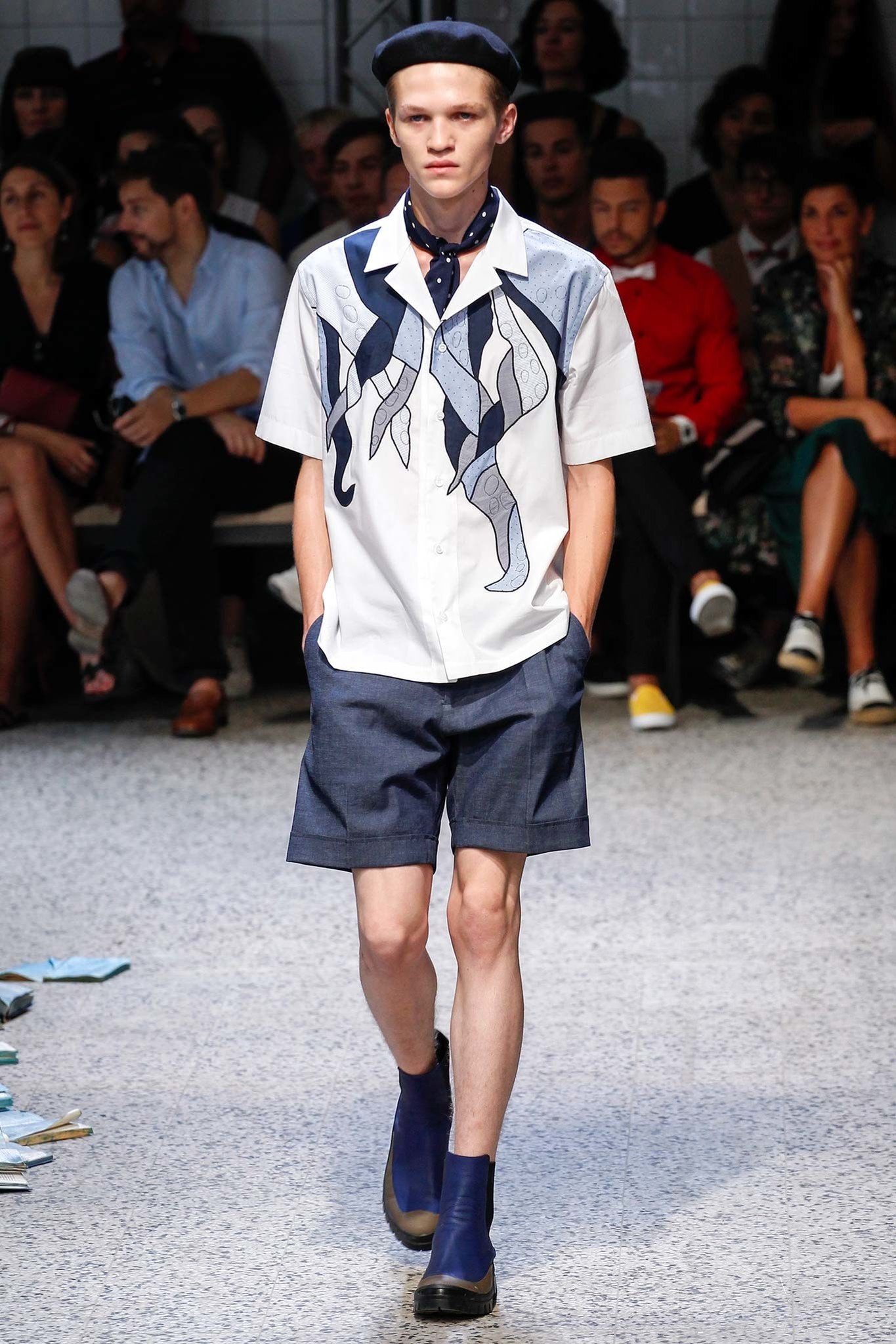
Antonio Marras has made this a cohesive look by styling with navy accessories that match the deep colours in the print.
For a Spring/Summer look, the white shirt is always prominent. The
print on the shirt, adds a playfulness and a casual tone to the
plaintive, infamous white shirt. Other variations of this shirt were
used in the collection, paired with prints on trousers and shorts that
emphasised the different patterns used in the patches.
LOU DALTON
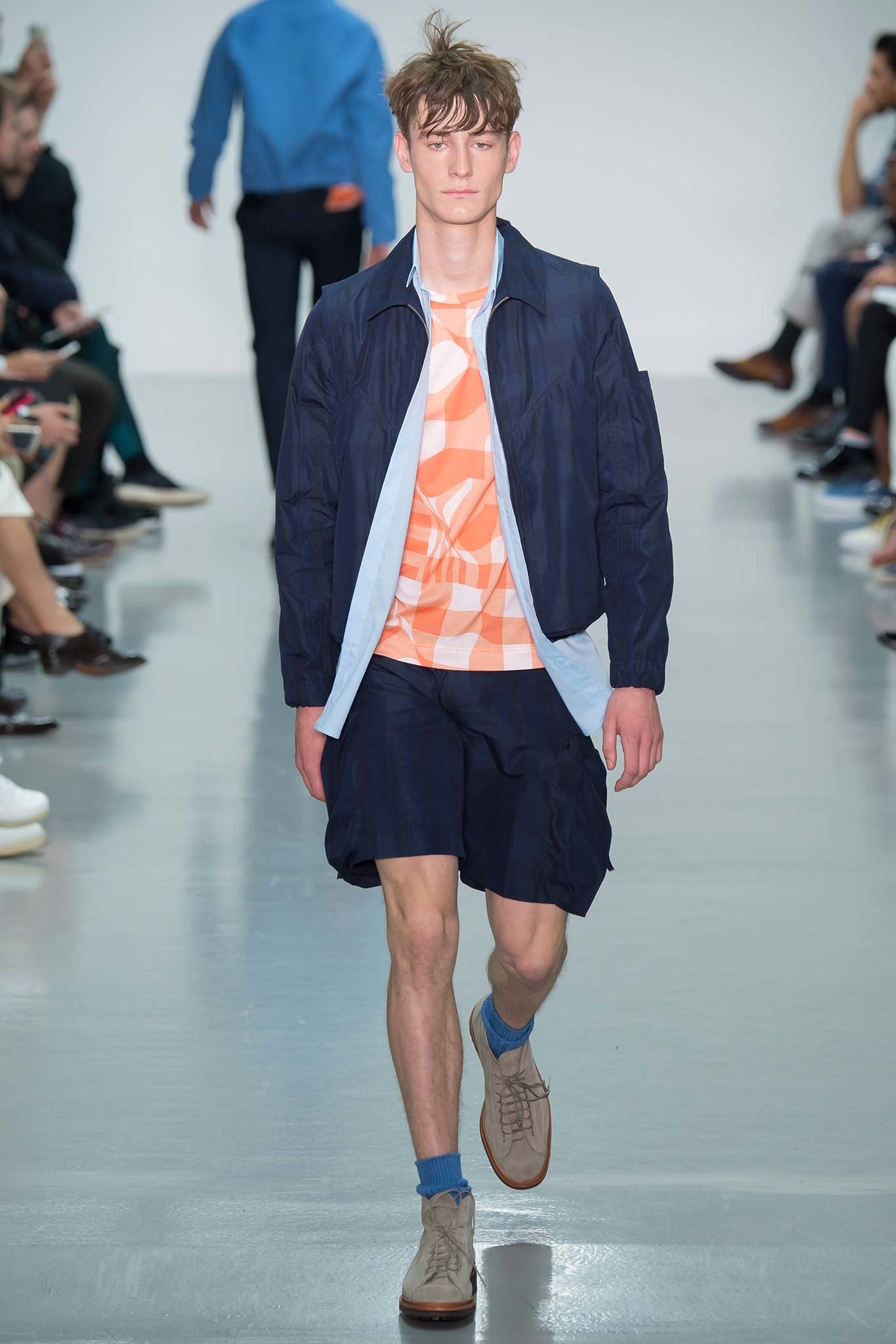
Bringing navy into streetwear can be a challenge as it’s difficult to
avoid creating outfits that all end up looking like tracksuits.
Lou Dalton created this bomber jacket look with matching shorts, both
with thick, darker navy stripes that give shape to the loose fitting
material. Pairing the shorts and bomber with the lighter blue, open
shirt underneath brings the lighter navy stripes to the forefront in the
jacket and shorts. Adding a touch of orange below the blue, stops the
orange being too loud, and places emphasis on the outfit’s layers. This
is look we’ll be sporting in the city.
DSQUARED2
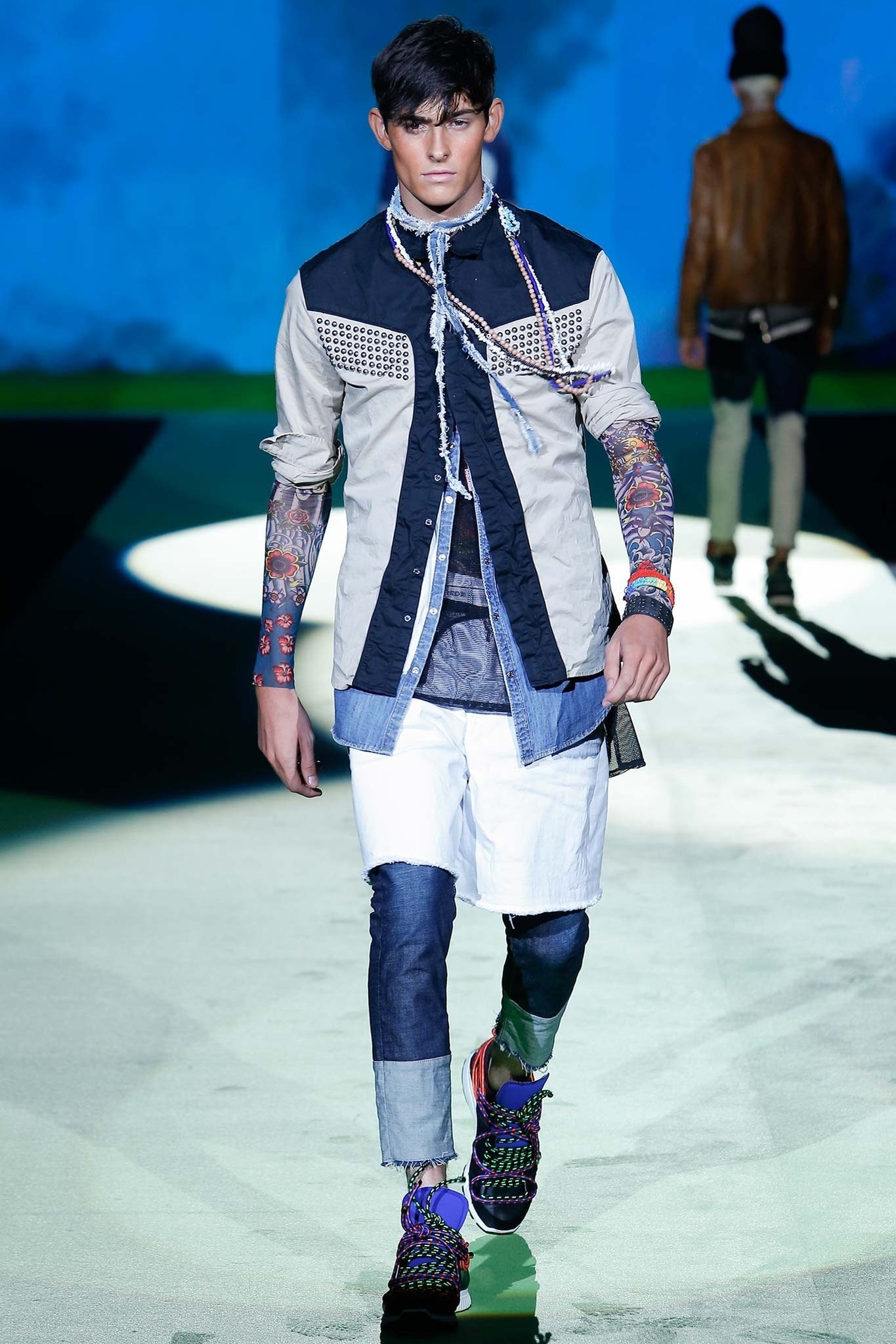
Breaking up navy panels is also a great way to add depth to your look like Dsquared2 have done in this image.
The mix-match of different blues, combined with the whites and greys
creates this eye-catching look, that’s filled with layers and
unconventional proportions. Even though the look has separate pieces,
the panels match, creating a great overall effect.
The rounded studs on the chest of the shirt, match with the necklace, completing this patchwork festival look.
ASHLEY ISHAM
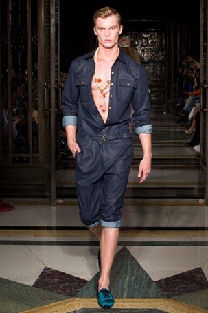
This coated denim playsuit is a great addition and piece to finish
on. To be worn on its own, or even with a vest underneath, this look can
be a simple yet full look to your Spring/Summer wardrobe.
Wooden accessories can be added to give off a beach vibe while silver
chains give it a more evening look. You can wear this with sandals and
loafers or even canvas trainers – sometimes keeping it simple can give
your navy looks a more expensive presence.