All our favourite designers are making navy interesting again
SS16 has been a great season for menswear. We are ditching the jeans,
and throwing on the playsuits, high-waisted trousers and tailored short
shorts. For our top halves, summer blazers are back and with enough
chiffon to swim in. While navy is commonly seen in jackets and trousers,
a full navy look shouldn’t be sneered at. Matching navy with the right
colours can show off an item’s detailing, removing all the components
that stop the garment looking too flat. Below are the designers that are
doing navy so well this season, so scroll down and get some inspo for a
chic summer.
CRAIG GREEN
Since AW13, Craig Green has been known for his cutting-edge,
architectural inspired collections; using block colours to his
advantage, accentuating detail and panelling. This season is no
different. The sheen on the denim for this particular looks helps to
emphasise the belt and pockets on the jacket, and is framed by the black
turtleneck and shoes, which keeps the look together. The black pieces
add depth to the shadows created by the garment.
CHRISTOPHER KANE
Let’s move on to Christopher Kane for our next example of navy done
well. Even though he’s used a darker navy in this look, Christopher Kane
has succeeded in giving these trousers depth by pairing them with
brighter accessories and a colourful trim on the jumper.
Using black on the top half, instead of white, makes the red and blue
appear brighter. These accents give the whole piece a Spring/Summer
vibe, but take those away and it could easily become part of an
Autumn/Winter collection.
MSGM
Massimo Giorgetti has shown a great example here of how to use a deeper navy for a Spring/Summer look in his SS16 collection.
Chiffon and other translucent fabrics are becoming increasingly
popular in menswear again. Keeping cool in a dark shade that soaks up a
lot of light and therefore generating heat can be a difficult task, but
the best way to help that is by using lighter textiles. The placement of
the pockets at the bottom of the shirt adds layers to not make it too
transparent the whole way down the torso, keeping some modesty. The
whole look gives off the feeling of luxe.
HARDY AMIES
A suit can look terribly flat in navy if it’s just a block colour,
however, dark blue co-ordinates are a favoured option for formal
occasions in the summer.
Hardy Amies has created this checkered suit that could be worn for a
formal occasion, or paired with a t-shirt for a more casual outing. The
pearl coloured buttons give a playfulness to the suit also without
taking away from the quality of the suit itself. With the colours
already in the check, this is a navy outfit to be styled with black or
charcoal accessories instead of burgundy or brown.
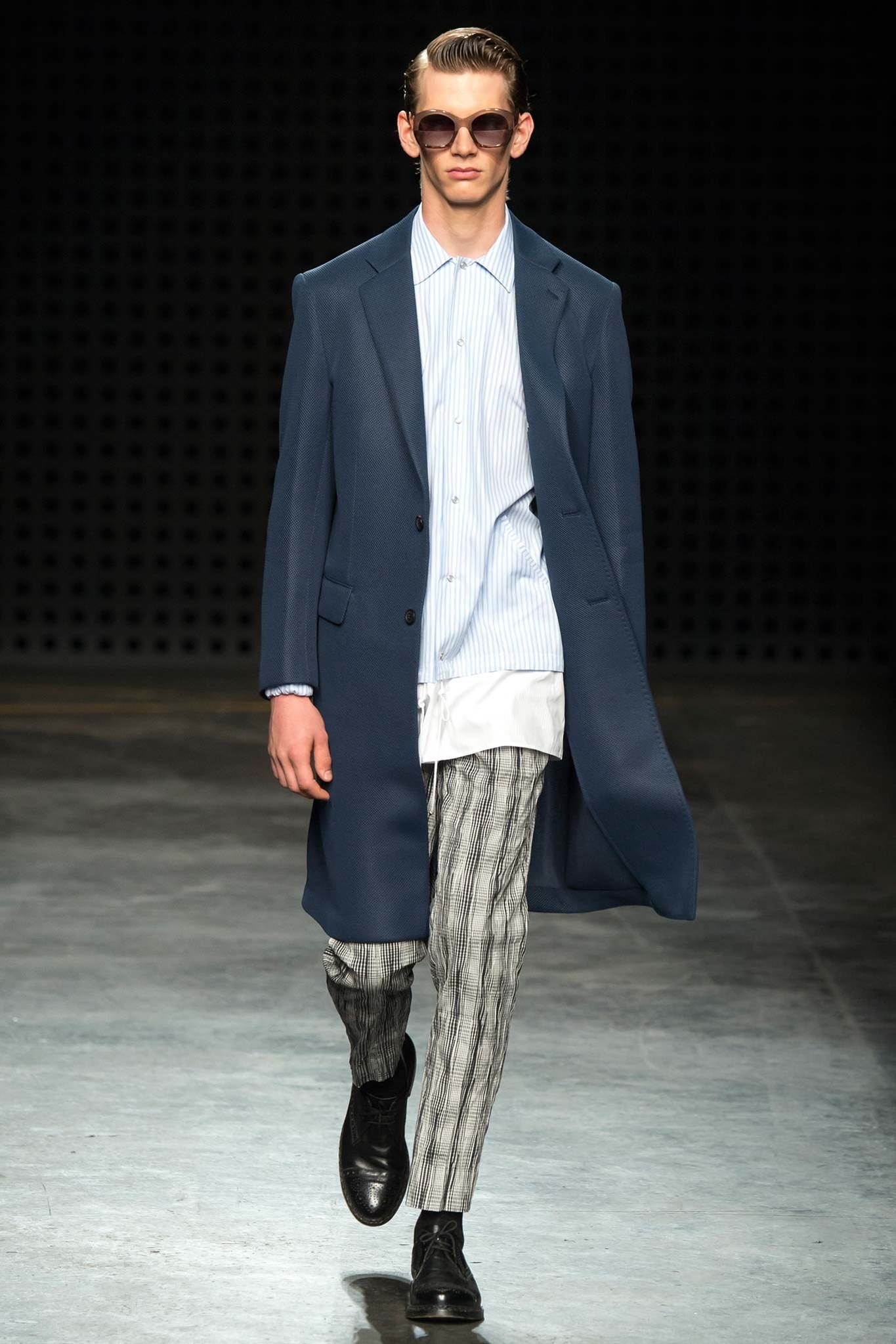
CASELY-HAYFORD
When you wear a block colour garment like Casely-Hayford’s jacket in
this image, styling it with brown accessories and prints can add texture
to the overall look.
The print in these trousers work vertically, which elongates the
model, but also mirrors the direction of the fabric’s texture. The long
shirt used adds interesting proportions to the outfit as a whole.
MATTHEW MILLER
Matthew Miller gives another example here of how to breathe life into an otherwise dull block-coloured navy suit.
By using creased linen in his suits, the texture of the suit looks
lighter and breaking up this look with a low-buttoned, un-tucked shirt,
Matthew Miller ensures the look appears less formal and heavy. The light
nature of the fabric also gives off some Miami Beach-type vibes. Ideal
for summer.
The slightly washed-out colour of the navy also makes the creases in
the linen highlighted, making the texture look purposeful, instead of
accidental.
ANTONIO MARRAS
Antonio Marras has made this a cohesive look by styling with navy accessories that match the deep colours in the print.
For a Spring/Summer look, the white shirt is always prominent. The
print on the shirt, adds a playfulness and a casual tone to the
plaintive, infamous white shirt. Other variations of this shirt were
used in the collection, paired with prints on trousers and shorts that
emphasised the different patterns used in the patches.
LOU DALTON
Bringing navy into streetwear can be a challenge as it’s difficult to
avoid creating outfits that all end up looking like tracksuits.
Lou Dalton created this bomber jacket look with matching shorts, both
with thick, darker navy stripes that give shape to the loose fitting
material. Pairing the shorts and bomber with the lighter blue, open
shirt underneath brings the lighter navy stripes to the forefront in the
jacket and shorts. Adding a touch of orange below the blue, stops the
orange being too loud, and places emphasis on the outfit’s layers. This
is look we’ll be sporting in the city.
DSQUARED2
Breaking up navy panels is also a great way to add depth to your look like Dsquared2 have done in this image.
The mix-match of different blues, combined with the whites and greys
creates this eye-catching look, that’s filled with layers and
unconventional proportions. Even though the look has separate pieces,
the panels match, creating a great overall effect.
The rounded studs on the chest of the shirt, match with the necklace, completing this patchwork festival look.
ASHLEY ISHAM
This coated denim playsuit is a great addition and piece to finish
on. To be worn on its own, or even with a vest underneath, this look can
be a simple yet full look to your Spring/Summer wardrobe.
Wooden accessories can be added to give off a beach vibe while silver
chains give it a more evening look. You can wear this with sandals and
loafers or even canvas trainers – sometimes keeping it simple can give
your navy looks a more expensive presence.
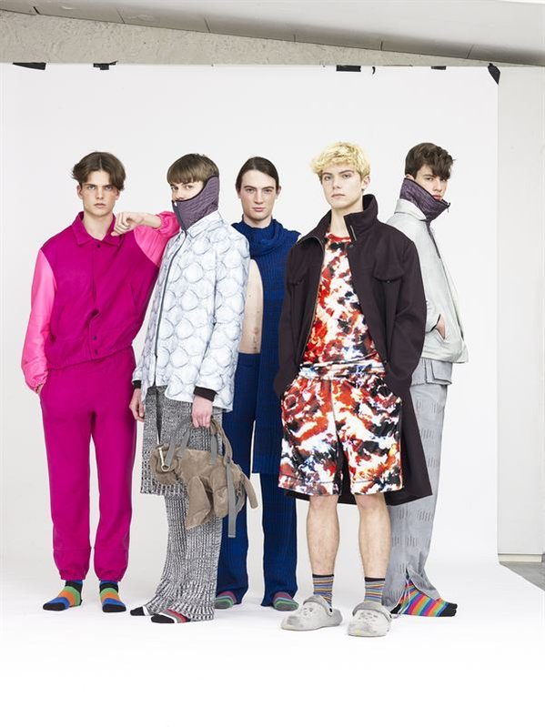
We take a look at Swiss-born menswear designer, Julian Zigerli who plays on our inner-whimsy for his AW16 collection.
Julian Zigerli‘s AW16 collection has us pining for our youth. Mixing comfy knits and printed blankets with animal-shaped suede bags he adds a homely touch to the bright-coloured streetwear of his winter line. There is a nostalgic effervescence to his concept, which features tiny Power-Puff Girls prints on trousers which have a 360-degree print to look like ripped jeans.
What’s most striking about the collection are the three bomber-jacket looks in day-glow orange, yellow and pink, which brings to mind memories of highlighter pens used in school, as well as some tie-dye looks. Here childlike activities are translated into the fabrics of the collection.
Moving onto the comfy stretch-knits in Julian’s work this season, the pieces when worn together can pass as a cool, winter 70’s flare trousers throwback. But when worn as separates, the quality of the knit is perfect to combine with tailoring or sportswear. It is a multi-functioning collection with great pieces that can stand out.
What a lot of street wear brands are missing, is the quality of fabrics and it’s construction. Julian’s line is finished to a very high standard, more focused on the quality of each piece rather than mass-production. The brand is stocked internationally and online, with the sole stockist in London being Monologue in Shoreditch.
I look forward to seeing him in many more stores across London in the future.
The late and great artist, Prince corresponded his album covers and tours to be a whole cohesive art piece by using styling as a tool for the visual experience of each album.
It’s common for artists to launch album campaigns as whole artistic pieces and to consider how the album will translate on stage as well as through speakers. The visual element of an album, especially the outfit design, becomes a necessary part of the album’s tour and means to promote album. This is basic marketing and works effectively in the music industry because it relies on the power of association. Prince, of course, was no exception to this. Even when performing songs from previous albums, his look was always in accordance with the period it was produced, whether it was a choice of colour or garment.
While it’s not new to associate a tour’s wardrobe with the visuals of an album, Prince would normally go one step further in that idea, always having a specific and organised look for each album, further linking his public appearances to his music on a visual level. David Bowie was also a pioneer when it came to this promotion technique; however, his looks tended to vary as he adopted new personas, as opposed to Prince whose styles corresponded with particular albums.
Purple Rain
Let us start with the most iconic outfit, the Purple Rain new-romantic purple suit, matched cohesively with a jabot to complete this look. Different variations of this look were altered through time on different tours to keep it current but relevant. The album was released in 1984, when new-romanticism was already a fashion trend at the time. It was first introduced in 1979 by bands such as Visage, Duran Duran and Spandau Ballet and has since become an iconic part of early-80s pop culture. Even though not completely revolutionary, this outfit is still arguably Prince’s most remembered look, but is this because of the association with his most famous song?
Dirty Mind
Even though Purple Rain was Prince’s 6th album, his silhouette has been consistent throughout his career; big hair and emphasised shoulders, resulting in an asymmetric and triangle-like silhouette. It is worth mentioning that Prince was only 5’2 tall and adopting this style helped in elongating his body in photographs. The notorious high-waisted trousers with flared bottoms, present in many of his looks, visually extended the length of his legs as well as concealed his high heels. Such trousers in combination with cropped jackets shortened the torso and made the arms seem longer.
Prince’s cover for the Dirty Mind album (1980), is a clever example of his play with proportion. The half body portrait of him in a leather jacket with padded shoulders, bulks out the top half of his body and adds proportion. In addition to this, his legs have been cropped out, leaving no possible way to guess his height.
Parade
Prince’s look is often said to be androgynous, however in the context of his work this seems to be more like a fallback term for his aesthetic, as there are no images or album covers which visibly question his gender. The 1986 cover for Parade features him in a cropped waistcoat, which was later worn during the album’s tour, and it seems like that particular look was intentionally pushing for a more feminine image. There was, however, a conscious effort in keeping his look borderline-‘appropriate’ for the more puritanical members of the audience, which was achieved with his trademark facial hair, on top of his slight but muscular physique. Having to consider a more conservative opinion was an issue largely present in the 80s and up until the Parade album cover, all of Prince’s looks were still on the cusp of hetero-normative subcultures and trends.
Lovesexy
Two albums and two years later (1988), the Lovesexy cover (his 10th studio album) rebirthed Botticelli’s The Birth of Venus. Photographed by Jean-Baptiste Mondino, it showed Prince, naked, surrounded by giant flowers, in a reclining, effeminate posture, covering his groin and chest . This cover was one of his most radical gestures in terms of an image of male sexuality and caused major disputes with some record shops, resulting in many refusing to stock such a controversial image. Produced, of course, with marketing and fan-service in mind as well as a more sophisticated discussion on gender, the album artwork caused a stir, which was a dangerous yet successful promotion technique.
Diamonds and Pearls
However, Prince was more than aware that controversy would only push his work so far. Three years after (1991), Prince released Diamonds and Pearls, which had a more formal style showing an image of Prince and a woman clasping his chest, produced with the consideration with the fact that his sexualised image was to a large extent, targeted at women.
This particular album signified a shift from a variety of studded sparkling jackets and unconventional menswear tailoring, to a more conventional, masculine character. Diamonds and Pearls was produced in the early 90s along with the emergence of such artists as MC hammer, Vanilla Ice, and Public Enemy and when hip hop was experiencing its ‘Golden Age’.
Whilst still following the music trends, Prince had to correspond with a visual image that was distinctly him, but also genre-appropriate. Baring in mind the mentality associated with hip-hop, especially so in the early 90s, the decision to portray Prince with a woman can be seen as a tactic to appeal to the male audience.
Musicology
Between 1991 and 2004 Prince mostly released instrumental albums which did not feature him on their covers, and were neither followed by tours. Then, Musicology came out in 2004 and presented a completely new Prince. Even though there were no stylistic themes to the album’s imagery, the outfits on the tour that followed were strongly influenced by American gangster style clothes. Very similar to the suits worn in the Zoot Suit Riots in LA in the 1970s; they consisted of block colours, high-waisted pleated trousers, long coats and trilby hats.
Planet Earth
More albums such as The Chocolate Invasion (2004), The Slaughterhouse (2004), and then 3121 (2006) were released in the next few years, but it wasn’t until the release of Planet Earth in 2007 that he held an album tour. It only consisted of 21 nights in London, but more importantly it featured Prince back on the album cover again. This time, he stood over the Earth in a red silk shirt and black corset. Unlike previous album tours however, there was no definitive theme to the tour outfits – it was much more of a celebration of the previous images of Prince; showcasing a variety of looks during this extended stay at the O2 Arena.
Art Official Age
After that, there were no tours that followed the release of an album. However, he did release MPL Sound (2009), 20Ten (2010), PlectrumElectrum (2014), and finally Art Official Age (2014), all of which represented a more futuristic aesthetic. The cover of Art Official Age was the epitome of Afro Futurism, showing Prince in a golden gilet, sand turtle-neck and triple-lensed sunglasses. This was his final and 37th full-length studio album.
These examples of the power of association when it comes to promoting an artist are key. Recent artists such as Lady Gaga, Beyoncé and M.I.A have used similar techniques to attach certain visual or political anchors to their songs and albums. Prince made himself appeal to such a broad audience by promoting his sexuality as a man, but in completely different ways depending on the gender that was taking it in. To be able to successfully portray yourself both as a masculine character, but also effeminate and sensitive means that you have both genders relating to some part of your personality.
By using styling as a tool to further his art, instead of just “a look”, Prince was able to re-characterise himself again and again, expanding his appeal and broadening his audience each time.